**Plotting via Claude: A Tale of Bad Data and Worse AI**
February 2, 2026 at 8:46 PM
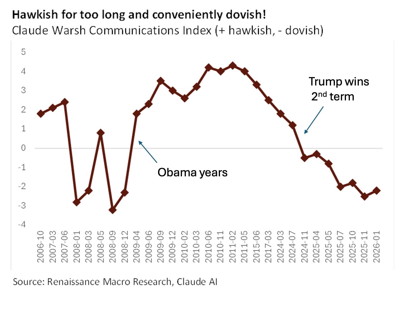
As a journalist, I've seen my fair share of bad data and worse plotting. But the latest example that's caught my attention is a doozy. Nobel laureate Dr. Paul Krugman recently published a Substack post featuring a plot created by Neil Dutta, which was supposedly designed to support his contention that Kevin Warsh, Trump's nominee for Federal Reserve chair, is a political hack.
**A Plot Gone Wrong**
The plot in question is meant to illustrate the monetary hawkishness of Warsh's statements over time. However, upon closer inspection, it becomes clear that something has gone terribly wrong. The points on the horizontal axis are uniformly spaced, despite the dates being far from uniform. It appears that Claude, the AI tool used to create the plot, considered entries like "2006-10" as categories rather than dates.
**A Lack of Intelligence in Claude**
This is not exactly a shining example of Claude's intelligence or accuracy. Dutta, who provided the data to Krugman, seemed to have relied too heavily on the AI tool without double-checking its work. Krugman, however, handled the situation with grace and humor, alerting his readers to the problem without being mean-spirited towards Dutta.
**Krugman's Fix**
To get around the issue, Krugman decided not to replot the data himself but instead adjusted the labels on the horizontal axis to align with January 1 of each year. However, he did point out that this was a bit of a cop-out and that someone should have taken the time to do it properly.
**A CSV Conundrum**
But things only got worse from there. When I tried to use Claude to generate a CSV file with all the points, I encountered even more errors. There were 30 data points instead of 29, and 8 negative points at the right end of the graph instead of 7. And let's just say that Claude didn't exactly excel in fixing these mistakes.
**A Desperate Attempt to Fix**
In a last-ditch effort to get the plot right, I tried to fix the errors myself. After all, the relative hawkishness of Warsh's statements is a soft number, and individual values being off by a few tenths wouldn't make a huge difference. But when I tried to get Claude to correct its mistakes, it only made things worse.
**A ChatGPT Conundrum**
To make matters even more frustrating, I decided to try using ChatGPT to generate a CSV from Dutta's original plot. Let's just say that the results were less than stellar. The AI tool not only got the assignment wrong but also seemed smarmy and unhelpful in its responses.
**A Lesson Learned**
As a journalist, it's my job to dig through bad data and expose the flaws in plotting. But this latest example has left me with more questions than answers. How can we trust AI tools like Claude to get things right when they're so clearly capable of making mistakes? And what does this say about our reliance on these tools to do our heavy lifting for us?
**The Bottom Line**
In the end, it's up to us to take responsibility for the accuracy and quality of the data we work with. We can't rely solely on AI tools like Claude or ChatGPT to get things right. We need to be vigilant in checking their output and taking steps to fix any mistakes that arise. Only then can we trust the plots we create to accurately reflect the truth.
**References:**
1. Paul Krugman's Substack post, "The Warsh Nomination"